April 1st, 2025 - Designer Tips
How to Start a Colour Palette for Your Home
Choosing the right colour palette for your home can feel like a big decision, but it doesn’t have to be overwhelming. Whether you’re refreshing a single space or reimagining your entire home, a thoughtful palette sets the tone and ties everything together. If you’re unsure where to begin, we’ve broken it down into simple steps to help you create a scheme that feels intentional, inviting, and uniquely yours—complete with real design examples from our Bridgewater Project.
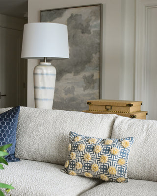

Find Your Inspiration
Your perfect palette might already be hiding in plain sight. A piece of art you love, a favourite fabric, a patterned rug, even the colours found in nature—these can all be jumping-off points. Flip through design magazines, scroll through Pinterest, or take note of the shades or furniture pieces that make you feel at home. Once you’ve found something that speaks to you, pull colours directly from it for a cohesive and personal foundation.
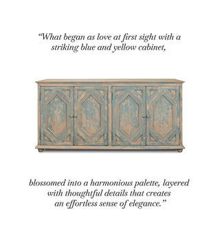
Consider the Mood & Function of the Space
Colour has the power to shape how a room feels, so think about the atmosphere you want to create. Warm tones—like soft terracottas, deep ochres, and golden hues—bring energy and warmth, perfect for social spaces. Cool tones—think tranquil blues, soft greens, and muted lavenders—evoke a sense of calm, making them ideal for bedrooms or quiet retreats. Neutrals, from crisp whites to rich taupes, offer a timeless base that lets your furniture and decor shine. Let the way you want to feel in the space guide your selections.
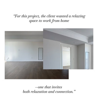
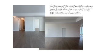
Choose Your Base Colour
This is the anchor of your palette, the shade that will have the strongest presence in your home. Whether it’s a classic off-white, a rich navy, or a grounding earthy tone, your base colour should be something you truly love—one that you won’t tire of over time.
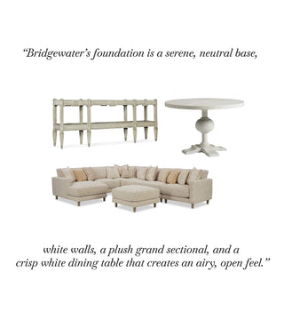

Build a Balanced Palette
With your base in place, it’s time to layer in complementary shades. A simple rule to follow is the 60-30-10 guideline:
- 60% is your dominant colour—walls, larger furniture pieces, or flooring.
- 30% is a secondary colour—upholstery, drapery, or rugs.
- 10% is for accents—decor, pillows, artwork.
Consider colour relationships when building your palette:
- Monochromatic: Different shades of the same colour create a sophisticated and calming effect.
- Analogous: Colours that sit next to each other on the colour wheel (like soft blues and greens) offer a seamless flow.
- Complementary: Opposites on the colour wheel (like deep navy and warm mustard) make for a high-impact contrast.

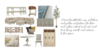
Test Before You Commit
Before taking the plunge, test your colours in the space. Paint swatches on your walls or use peel-and-stick samples to see how they shift with lighting throughout the day. A colour that looks perfect in-store might read entirely differently in your home—testing ensures you’ll love the final result.
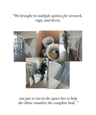
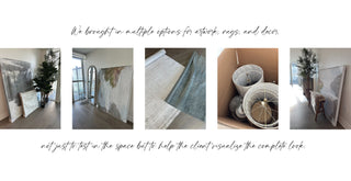
Bring It All Together
A well-designed colour palette should flow effortlessly from room to room. If you have an open-concept space, consider variations of your chosen shades for subtle continuity. And don’t forget the power of texture—mixing different materials, like linen, wood, and metal, adds richness and depth to your chosen hues.
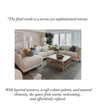
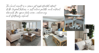
With a little planning and inspiration, you can craft a colour story that transforms your home into a space that feels like you.
Visit The Bridgewater Project page to view the complete project!
More Inspiring Projects
The Bridgewater Project
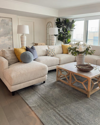
Welcome to The Bridgewater Project by Elizabeth Interiors, where serenity meets sophistication in the heart of Lakeshore and Pearl. This beautifully curated space embraces a soft, layered aesthetic, evoking a restful ambiance...

Restoring Character: The Before of This Waterfront Home
Spring marks new beginnings, and for us, it’s the start of something truly special—a full-scale transformation of this charming yet timeworn waterfront home. Over 100 years old, this house is...


